HTML Image
Images are a crucial part of the internet, adding richness and variety to web pages. This chapter will cover how to insert images into a webpage.
<img>
The <img> tag is used to insert images and is a self-contained tag with no closing counterpart.
1 | <img src="foo.jpg"> |
The above code inserts an image foo.jpg into the webpage. The src attribute specifies the image’s URL, which in this case is a relative URL, indicating that the image is in the same directory as the webpage.
By default, <img> is an inline element, meaning it aligns with the surrounding text.
1 | <p>Hello<img src="foo.jpg">World</p> |
In this example, the text and image are displayed on the same line.
Images are shown at their original size by default. If an image is large and on the same line as text, it will increase the line height and align the bottom of the image with the bottom of the text.
The <img> tag can be nested inside an <a> tag to make the image a clickable link.
1 | <a href="example.html"> |
Here, the image functions as a link and clicking it will navigate to example.html.
- alt attribute
The alt attribute provides a text description for the image. If the image fails to load (due to errors or user settings), the text will be displayed instead.
1 | <img src="foo.jpg" alt="Example Image"> |
In this code, if the image fails to load, the browser will display “Example Image” in its place.
- width and height attributes
The image is inserted at its original size by default. The width and height attributes can be used to specify the image’s dimensions in pixels or percentages.
1 | <img src="foo.jpg" width="400" height="300"> |
Here, width sets the image’s width to 400 pixels, and height sets the height to 300 pixels.
Setting these attributes reserves space for the image, regardless of whether it loads successfully. However, it’s usually better to control image size with CSS.
If only one of these attributes is set, the browser will automatically adjust the other dimension to maintain the image’s aspect ratio. For example, if an image is 800x800 pixels and width is set to 200, the browser will set height to 200.
- srcset and sizes
See the section on “Responsive Images” below for details.
- referrerpolicy
The default behavior of the <img> tag is to include a Referer header in the HTTP request. The referrerpolicy attribute controls this behavior.
- crossorigin
If an image is hosted on a different domain, loading it may require cross-origin authentication. The crossorigin attribute tells the browser whether to use cross-origin requests, which are not used by default.
When enabled, the HTTP request will include an Origin field specifying the request’s domain. The crossorigin attribute can be set to two values:
anonymous: Cross-origin requests will not include user credentials (such as cookies).use-credentials: Cross-origin requests will include user credentials.
Example:
1 | <img src="foo.jpg" crossorigin="anonymous"> |
Omitting the value is equivalent to anonymous:
1 | <img src="foo.jpg" crossorigin> |
- loading
By default, browsers start loading images as soon as they encounter the <img> tag. This can waste bandwidth for images that are not immediately visible on long pages. The loading attribute changes this behavior, enabling lazy loading, where images are only loaded when they are about to enter the viewport.
The loading attribute can have the following values:
auto: The default browser behavior, equivalent to not usingloading.lazy: Enables lazy loading.eager: Loads the image immediately, regardless of its position on the page.
1 | <img src="image.png" loading="lazy" alt="…" width="200" height="200"> |
To avoid layout shifts caused by lazy loading, it’s best to specify the image’s width and height.
<figure>, <figcaption>
The <figure> tag acts as a container for images and related content. Its optional child element, <figcaption>, provides a textual description of the image, often used for captions and can appear multiple times.
1 | <figure> |
Besides images, <figure> can also enclose other types of content, such as quotes, code snippets, or poetry. It serves as a semantic container for grouping main content with its supplementary information.
1 | <figure> |
Responsive Images
When a website looks good across devices of various sizes, it’s known as “responsive design.” The images used in responsive design are called “responsive images.”
There are several solutions for responsive images, including JavaScript and CSS, but the best approach in terms of semantics is using HTML, which is natively supported by browsers.
The Problem
The <img> tag is used to insert images into a webpage, and by default, it inserts the same image for all situations:
1 | <img src="foo.jpg"> |
This means the image foo.jpg will be displayed on both desktop and mobile devices.
While this approach is simple, it has three main drawbacks:
- File Size: Desktop displays require larger images with higher file sizes, while mobile screens need smaller images, which can save bandwidth and speed up page loading.
- Pixel Density: Desktop monitors usually have a standard pixel density, whereas mobile screens often have higher pixel densities (Retina displays), which combine multiple pixels into one. This can cause images to appear blurry on mobile devices if they are not high enough resolution.
- Visual Detail: Desktop monitors have more screen space and can show more detail, whereas mobile screens are smaller and may need to emphasize key details while minimizing unnecessary elements.
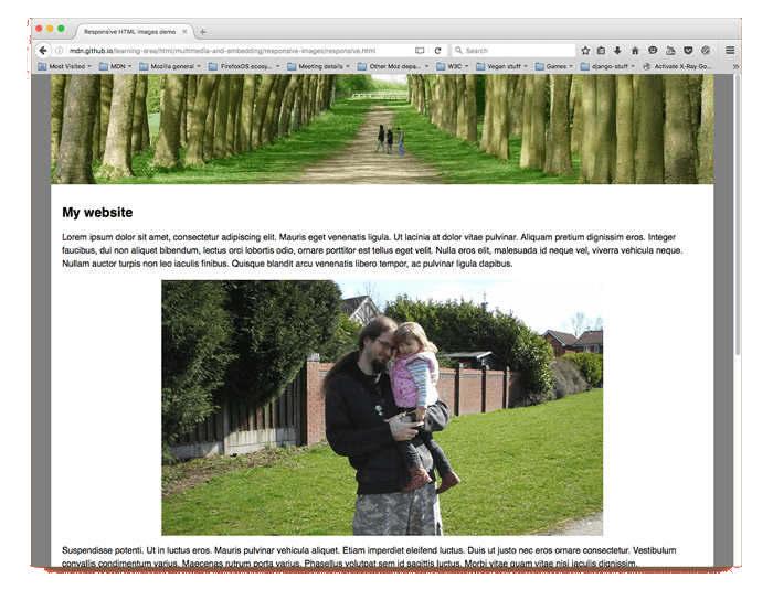
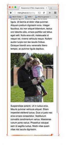
In the two images above, the phone image at the bottom, which has been cropped, highlights the main focus more effectively and has a noticeably better visual impact.
srcset Attribute
To address these issues, HTML provides a comprehensive solution through the srcset attribute. This attribute allows the <img> tag to specify multiple image sources for different pixel densities. The value of srcset is a comma-separated list of image URLs, each followed by a space and a descriptor indicating the pixel density. Here’s an example:
1 | <img srcset="foo-320w.jpg, |
In the code above, the srcset attribute lists three image URLs to accommodate three different pixel densities. The pixel density descriptor is in the format of a multiplier followed by ‘x’. For instance, 1x represents the standard pixel density and can be omitted. The browser will choose the appropriate image based on the device’s pixel density.
If none of the images specified in srcset are suitable, the browser will default to the image specified in the src attribute.
sizes Attribute
The srcset attribute alone only addresses pixel density. To handle different screen sizes and ensure images are displayed at the correct size, you need to use it in conjunction with the sizes attribute.
First, list all available images using the srcset attribute:
1 | <img srcset="foo-160.jpg 160w, |
In this example, srcset provides four images, each with a width descriptor indicating the image’s original width in pixels.
Next, use the sizes attribute to define the display width of images for different screen sizes. The value of sizes is a comma-separated list of media query expressions and corresponding display widths:
1 | <img srcset="foo-160.jpg 160w, |
Here, the sizes attribute specifies three screen conditions and their corresponding image display widths:
- For screens up to 440px wide, the image width is 100% of the viewport width.
- For screens between 441px and 900px wide, the image width is 33% of the viewport width.
- For screens wider than 900px, the image width is 254px.
Finally, the browser determines the appropriate image size based on the device’s width from the sizes attribute and selects the closest matching image from the srcset list.
Assuming the device’s screen width is 480px, the browser determines from the sizes attribute that the image should be displayed at 33% of the viewport width, which is 160px. Since the srcset attribute includes an image that is exactly 160px wide, the browser will load foo-160.jpg.
If sizes is omitted, the browser will select the image closest to the display width from srcset. When using sizes, it must be used together with srcset, as sizes alone is ineffective.
<picture>
Responsive Design
The srcset and sizes attributes of the <img> tag handle pixel density and screen size adaptation, respectively. To manage different pixel densities and screen sizes simultaneously, use the <picture> tag.
The <picture> tag acts as a container that uses <source> and <img> elements to specify different images for various scenarios.
1 | <picture> |
In this code, the <picture> tag contains two <source> elements and one <img> element. The <source> elements use the media attribute for media queries and the srcset attribute to specify the image files. The sizes attribute could also be used here, but it’s redundant because of the media attribute.
Browsers evaluate the <source> elements in the order they appear, checking if the media query conditions are met. If a condition is satisfied, the browser loads the image specified in the srcset attribute and ignores the subsequent <source> and <img> elements.
The <img> tag serves as the default image, used when none of the <source> elements match or if the browser doesn’t support the <picture> tag.
In the example above, if the device width is 500px or less, it loads the portrait image; otherwise, it loads the landscape image.
Here’s an example that adapts for both screen size and pixel density:
1 | <picture> |
In this code, the media attribute of the <source> tags sets conditions for screen size adaptation, while the srcset attribute provides image URLs for different pixel densities.
Image Format Selection
In addition to responsive images, the <picture> tag can be used to select different image formats. For example, if the browser supports WebP format, it will load the WebP image; otherwise, it will load the PNG image.
1 | <picture> |
Here, the type attribute of the <source> elements specifies the MIME type of the image, and srcset provides the corresponding image URLs. Browsers check the <source> elements in order, loading the image if it supports the specified format and ignoring subsequent <source> elements. In this example, images are loaded in the following priority: SVG, WebP, and PNG.
References
Link to original article: